Eight Guidelines for Writing People of Color

 
Photo courtesy of @ThoughtCatalog

Photo courtesy of @ThoughtCatalog


by Sanjana Raghavan

If you’re a white writer, chances are you’ve wanted to write a character of color but worried about coming off as offensive or unrealistic. Diversity in writing is a good thing, and I’m all for increased representation—when it’s done right. As the daughter of Indian immigrants, I never saw myself in the books I read growing up. Now, that is slowly changing as more writers actively consider representation. So to help you better represent people of color in your writing, here are eight guidelines to keep in mind.

1. Be aware of stereotypes and then don’t use them. Even "good" or “positive” stereotypes — "Asians are smart,” or “Latinas are beautiful” — are harmful. Conversely, don't make us saints or superhumans, because we are also human (and a saint is a pretty boring character to read about, don’t you think?).

2. Do your research. Do not just rely on the one family of color that lived in your neighborhood when you were little, or what you’ve gathered from the media. Go out and read a ton of books by POC, go read Reddit communities by and for POC, etc.

3. Don’t describe our skin as food. I know this is a small one compared to the others, but this comes up often enough that it’s a huge pet peeve of mine. Imagine if I described your skin color as “mashed potatoes” or “whipped cream.” That would be weird, right? Just say their parents are Indian instead of opting for “mocha” or “caramel”.

4. Get POC to read your work, and then really listen to their feedback. This is helpful because they will catch things that you may not have intended, or can point out places which make the character seem like a stereotype. Don’t take their feedback as a personal attack; we all have biases we may not be aware of, and it’s good to listen and learn.

5. No dialect. Don’t try to type out accents. It often comes across as racist or off putting and is not necessary to your story.

6. Avoid making your only POC half white and then describe them with only white features. Mixed people have their own struggles to be sure, but all too often, POC only seem to be acceptable when we appear white.

7. Realize that racism is still an everyday reality. We don’t have the choice to ignore it, so neither will you when you write a POC. Keep in mind different people deal with racism in different ways, and research microaggressions to get a sense of everyday racism and ignorance.

8. There is more to us than “black,” “Asian,” etc. Develop characters who are human, who feel multi-dimensional. Race is an unavoidable part of life for POC, but we are also multifaceted and have varying interests. Black people can be engineers, Indian people can love hip hop and rap.


Headshot.JPG

Sanjana Raghavan is an undergraduate student at George Mason University. You can find her work at Lunch Ticket and New Flash Fiction Review.

Dear Friends of Stillhouse Press

We're offering free shipping on all of our titles for the indefinite future, when you buy our books directly from www.stillhousepress.org. Allow us to explain why.

These are tumultuous times for small indie publishers. Like most small presses, Stillhouse has spent the past few months attempting to adjust to a set of sudden policy changes at Amazon, which have dramatically affected all publishers, but especially very small presses, like Stillhouse. Here are links to a few good explanations and discussions of this change:

When Stillhouse Press published its first book, Wendi Kaufman's wonderful Helen on 86th Street and Other Stories, in the fall of 2014, Amazon stocked the book regularly and made it available on the usual shipping schedules. Our next five books were also listed this way. But starting in January of this year, that reliability came to an end. If a book wasn't "temporarily out of stock," it was listed as available in "1-4 weeks," or even "1-2 months." 

This is patently false. Both Stillhouse Press and its distributor, Ingram, have an ample stock of books.

If you visit Amazon to purchase one of our books and they are telling you it will take more than a day or two to ship, or that it is "temporarily out of stock," please consider purchasing from Stillhouse directly. Or, if you are lucky enough to have an independent bookseller nearby, consider ordering our books from them. It may take a few days, but you'll be supporting a local business that provides jobs to your neighbors, and helps to strengthen your local economy. 

And, as always, from all of us at Stillhouse Press, we thank you for your support!

Sincerely,

Stillhouse Press

2017 Spring Conference Review

By Caitlin Herron


It’s spring conference season in the DMV, and it’s a great opportunity to connect with your literary community, grow your skills, and network with other local writers.  Regardless of your writing experience or genre, there are several upcoming events where you can hear some fantastic readings, socialize, and expand your knowledge of the writing world (and even catch some of our authors in the process!) These are events you won’t want to miss!


2017 NEW LEAVES WRITERS' CONFERENCE

Hosted by Fall For The Book, in coordination with George Mason University's Creative Writing Program.

George Mason University, Fairfax Campus
Monday, April 3 - Friday, April 7
Registration: Free
 

With no registration fee and no sign-up required, this conference is great for writers with changing schedules. This years’ conference highlights its first “Day of Translation” on Wednesday, April 5, presented by our friends at The Alan Cheuse International Writers Center and The Center for the Art of Translation. The day features acclaimed translators and writers presenting on “Translation as a Political Act,” “The Art of Translation,” and other topics. The rest of the week includes readings from established writers Laura van den Berg, Spencer Reece, Helon Habila, and the Loud Fire reading by Mason’s MFA students. (Several Stillhouse Press staff members past and present will be there, so don’t miss it!) On Tuesday evening, Mason MFA alum Mike Scalise will be reading from his memoir "The Brand New Catastrophe "(Sarabande Books, 2017). And on Wednesday night, be sure to check out Linda Chavers reading from her chapbook "(This Fucking Body Is) Never Yours," from our friends at Gazing Grain Press.


ARTOMATIC

Crystal City, Arlington, VA
March 24 - May 6
Entry: Free
 

Artomatic is a fun way to experience all of the performing and visual arts the D.C. area has to offer - in an old laundry building! That’s right, this space has been converted into a venue for writers and visual and performing artists to showcase and sell their work. With so many weeks to visit, there is plenty of time to get a taste of this unique event. Come April 1 for a reading by Stillhouse's Andrew Gifford, author of "We All Scream: The Fall of the Gifford's Ice Cream Empire" (forthcoming May 1, 2017), and get your hands on his exciting memoir a full month before its official release.


CONVERSATIONS & CONNECTIONS: PRACTICAL ADVICE ON WRITING

Hosted by Barrelhouse
George Mason University, Arlington Campus
Saturday, April 22, 9am-6pm
Registration: $70
 

This conference is the premier way to connect with writers and editors through a day packed with workshops, panels, and ending in a legendary boxed wine reception! Panel discussions include flash fiction, point of view, handling grief, and a myriad other topics.  There will even be a panel with Barrelhouse Magazine editors giving advice on how to get your work out of the slush pile and into a lit mag. This year's conference will feature our very own editorial director Marcos L. Martínez, Stillhouse friend and Editor of Smokelong Quarterly, Tara Laskowski, and Rion Almicar Scott, author of "Insurrections" (The University Press of Kentucky 2016), a 2016 Pen/Faulkner finalist. A highlight of this conference is its speed dating event, where attendees can bring their poetry, short fiction, or first few pages of an essay or story for a 10 minute critique with an editor. Lit mags attending include Barrelhouse, Smokelong Quarterly, Potomac Review, Gettysburg Review, and many more. This conference offers a great way to get feedback on your work from a range of editors in your genre.  The best part?  Your registration gets you a book by a featured writer and a subscription to a participating lit mag.  At $70, you get a lot of bang for your buck!  


KENSINGTON DAY OF THE BOOK FESTIVAL


Kensington, MD
Sunday, April 23, 11am-4pm
Registration: Free


The Kensington Day of the Book Festival is a lively outdoor literary festival for every reader in your family. Over 100 authors, poets, and artists will be lining the streets of this charming downtown for book sales, readings, and more! There will be tents with an on-the-spot poetry competition, an outdoor kid’s show, and even demonstrations from cookbook authors. Stillhouse's Andrew Gifford, ("We All Scream," May 2017) is a special guest speaker, so you won’t want to miss this event, rain or shine!


BOOKS ALIVE! 5th ANNUAL WASHINGTON WRITERS CONFERENCE

Hosted by Washington Independent Review of Books

College Park Marriott Hotel & Conference Center
Hyattsville, MD
Friday, April 28 – Saturday, April 29
Registration:
Mar. 2 – Mar. 31 $250
Apr. 1 – Apr. 29 $260
Student Discount rate: $130
 

If you have a novel, story collection, or idea that’s itching to be pitched, this is this conference to hit this spring! After Friday’s “How to Pitch an Agent” session, participants will have the opportunity on Saturday to meet face to face with up to three agents for five minutes apiece. Agents are looking for work in all genres: YA novels, memoir, sci-fi, fantasy and more. Not looking to pitch? There are still plenty of panels from publishing industry experts to attend, including the keynote address from Judith Viorst, best known the children's classic, "Alexander and the Terrible, Horrible, No Good, Very Bad Day." This is a great event to meet established authors in your genre and get advice from industry experts!


12246876_1657121484548276_2548580781967135878_n.jpg

Caitlin Herron is the events intern for Stillhouse Press and a copy editor for George Mason's student newspaper, Fourth Estate. She will graduate with a BA in Writing and Rhetoric in December 2017.  She also works part time in Parks and Recreation for Fairfax County. 

From Still to Shelf, Pt. 3: The Ins and Outs of Book Design

When a manuscript has finished its journey through developmental editing, substantive editing, and copyediting, it’s still just a text document. The actual process from manuscript to book involves more than just slapping on a copyright page and cover. Hundreds of tiny choices must be made along the way: what font should be used for chapter titles, body text, the epigraph?  What kind of symbol or image should provide scene divisions?  How much white space should the book contain? What should the color scheme of this book be? Artistic and highly specialized professionals guide Stillhouse Press in these decisions, making up the core of our design team. 

We rely primarily on two people for the bulk of our design work: Kady Dennell, a freelance designer develops our interior layout and design, while our Art Director, Doug Luman handles cover design and brand development. Like each aspect of Stillhouse, book design is a collaborative process between. It’s important to us to not only develop an aesthetic and marketable product, but also to create a book that serves as a visual archetype to its literary content. For this post, we invited Kady to share some of the intricacies of this process.


Interior

Kady Dennell

The interior design process begins with design inspirations (interior layout and font choices used in other books that are either market matches for the current project or just well-designed products) from the author, the book's managing editor, and Stillhouse's Editor in Chief, Marcos L. Martínez. After the team decides on a direction, I browse through my library of fonts or research online for typefaces that will achieve the desired look. There are many aesthetic “families” that exist in typography, each with its own aesthetic consequences. The style of a font and its placement on the page, while it seems a simple thing, can completely alter the meaning of the content.  Consider a sign for a hardcore workout bootcamp written in delicate cursive, or an entire novel presented in bolded comic sans. Neither of these properly evokes the genre, purpose, or central aesthetic of the content that the physical language is meant to represent.

A mid-process design mock-up for the cover element of POP!

A mid-process design mock-up for the cover element of POP!

Once I’ve found a set of typefaces that match our intended aesthetic, I then propose two or three layout concepts to the publishing team for their input. These concepts will consist of ideas for page number placement, text size, font, headline placement, and body copy font and leading (the actual justification and margin work of copy on the page). From there, I adjust the layout design and prepare style guides and master pages in Adobe InDesign, an industry staple for publication design. The next step is styling the text for the whole manuscript, which is usually done with two main fonts (one for chapter titles and another for body copy). After all of the type is stylized, I adjust spacing to minimize orphans and widows—the design term for words left dangling across lines or left on lines by themselves. Once the manuscript is laid out in its entirety, I submit the file to the editorial team and they do a comprehensive review of the now fully designed book. Once their comments return, I implement any final changes and design edits, and then the final is ready for print.

Interior

Michelle Webber

The cover is the face of the book.  It is the first and often only chance to grab the attention of readers and encourage them to investigate what’s inside.  A bad cover—one that is ugly, busy, or confusing to its audience—can lose sales, regardless of the quality of the content within. Alternatively, a good cover aims to convey key elements of that content and inspires the reader to take a closer look. 

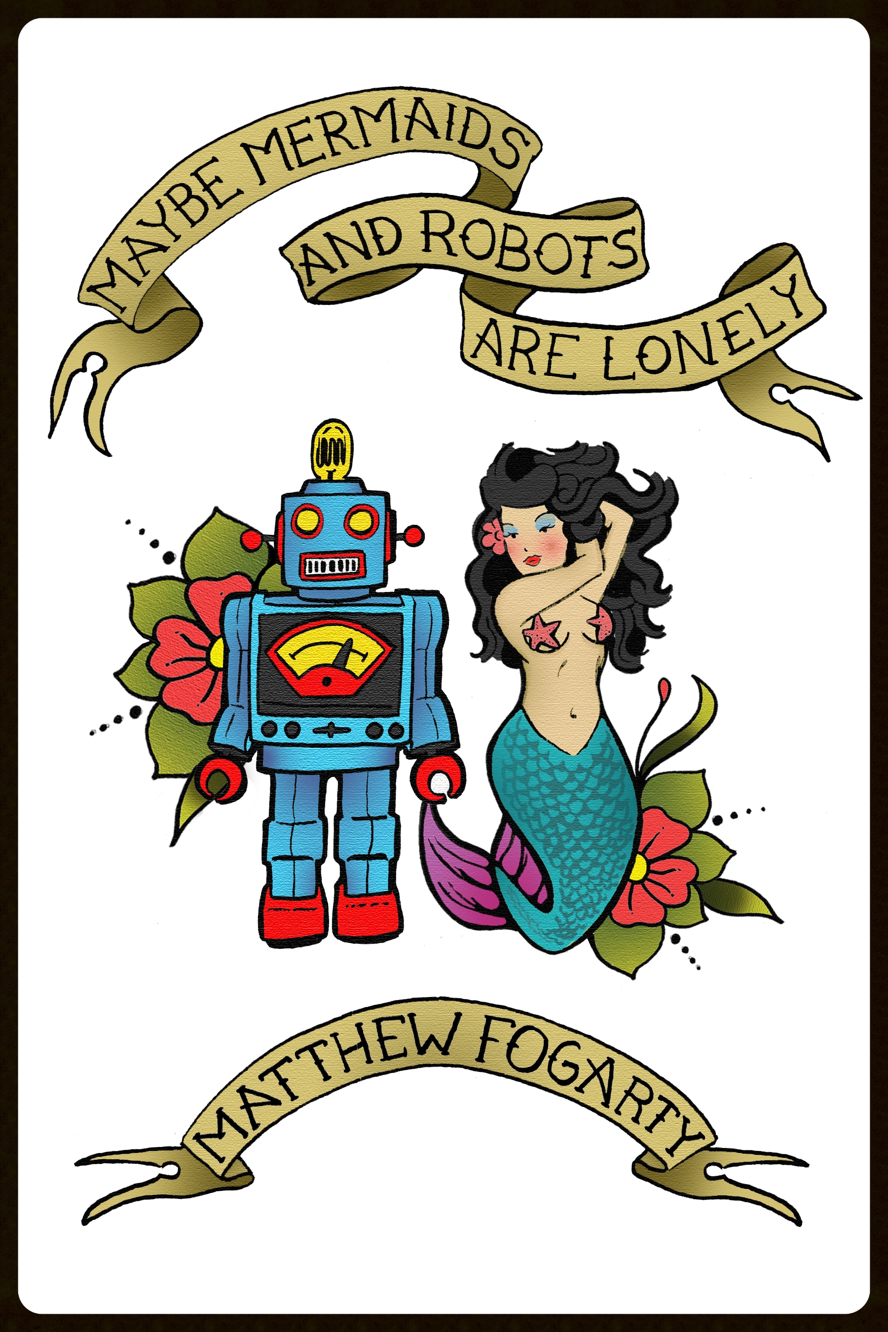
Our design process varies from book to book.  Some manuscripts immediately suggest a strong design direction.  For example, the design concept for Matt Fogarty’s Maybe Mermaids and Robots are Lonely emerged more or less as soon as our editorial team began discussing it (for a detailed look, read designer Alex Walsh’s post).

While the exterior design process is constantly evolving, it always begins with a conversation between our art director, Doug; the book's managing editor; the author; and the marketing team.  Some authors are more opinionated about the content of their cover than others.  Many come to the table with a list of things they absolutely do not want, which gives Doug a good place to start, though the beginning mock-ups are usually born from the manuscript itself.  Once a general aesthetic for the cover has been developed, it's up to the designer to produce three or four concepts, which are then presented to the editorial and marketing staff for fine-tuning. The concepts are the narrowed down to one or two options. Usually, the agreed upon cover concept goes through three or four drafts before reaching its final state, which includes the placement of our logo and branding, the cover copy, and the final spine design.  At that point, the marketing team signs off on the cover and it returns to Doug for final adjustments and rendering.

Once the interior and exterior designs have been finalized, the manuscript is then submitted it to our printer and a proof is ordered.  If everything looks as it should, advance review copies (ARCs) or "galleys" are ordered. These are sent to media and used to proof the book before it is sent out for final printing.


Kady Dennell is a freelance designer living in Portland, OR. She enjoys working with typography, (loads of) color, and photography. You can find her work at kdennell.com.


Michelle Webber has worked as a reader, an Editorial Assistant, and Social Media Editor for Stillhouse Press and currently serves as the Director of Marketing and Communications.  She is working on a science fiction novel and will graduate with a BFA in Fiction from George Mason University in the spring of 2017.

Tattoos & Nostalgia: Designing Maybe Mermaids & Robots are Lonely

by Alex Walsh

I’m not saying that cover design for a novel is easy, but there is certainly an extra level of difficulty when it comes to creating a cover for a collection of short stories. Matthew Fogarty's Maybe Mermaids & Robots are Lonely, which will be published by Stillhouse Press in September, contains such a variety of vivid, weird, and beautifully unique stories that to simply represent one story on the cover would have an injustice to the collection as a whole. While a drawing of a mermaid and a robot may give you some sense of what lies within, it does not fully illustrate the incredible range of Fogarty’s work. What about dinosaurs in space? What about Bigfoot working as a temp? What about zombies and cowboys, and a man who accidentally hangs himself on a copper wire? What about André the Giant?

An early iteration of the "tattoo" concept created by Walsh.

An early iteration of the "tattoo" concept created by Walsh.

With Maybe Mermaids & Robots are Lonely , my goal was to capture the whole of the collection, without giving away what it's really about. I wanted to allude to the presence of mythology and science fiction mixed with stories of great depth and realism, to greet the reader by saying, “In the pages of this book, you are going to see a lot of strange things and meet many interesting characters along the way. Come on in.”

Early in the editing process, conversations with Matt led me in the direction of creating a tattoo-like cover—something bold with vivid color, heavy in meaning and closely associated with memory. From there, I made a few sketches and designs that never came to fruition. Some were gritty, some were too complex, and some were overly cartoonish, but the real sticking point was that none captured the presence of nostalgia in the book. That was until we landed on the idea of the temporary tattoo, something people associate with childhood. Temporary tattoos represent a time in life when we’re most likely to drift into a world of make-believe, when we can erase our mistakes and are allowed countless "do-overs." But temporary tattoos are also associated with the weighty notion of the permanent tattoo, a very real and deeply meaningful adult concept. To us, this seemed to align perfectly with the tone of the book.

The Final Result: Maybe Mermaids & Robots are Lonely: 38 Stories and a Novella, Stillhouse Press, 2016

The Final Result: Maybe Mermaids & Robots are Lonely: 38 Stories and a Novella, Stillhouse Press, 2016

I then looked at how temporary tattoos come packaged: each fit tightly together on a single sheet of paper. It seemed like a viable way to feature all (or most) of the Maybe Mermaids characters on the cover, each placed closely against the others to make an almost-solid, almost-patterned image. Matthew and I selected 18 characters and objects from the stories, and I drew out each one. In order to keep things simple, all were inked with very little detail. This allowed the images to blanket the entire area of the cover without distracting from the title and secondary text. Then I selected bright, eye-catching colors, which I felt embodied the richness and energy of the book, and the cover became what it is today.

In a single glance, the reader may pick out a mermaid, a guitar, the Pope’s hat, a dog, a yeti, or an astronaut. They may ask questions about these creatures: What is a jet and an old Plymouth doing together on book? Who is this robot? What's Elvis got to do with anything? Each image comes together as part of one large tableau that suggests a new world filled with adventure and mystery, but also feels familiar.


Alex Walsh is a book designer for Stillhouse Press and Copy Editor for Phoebe: A Journal of Literature and Art.  He is also a student at GMU, where he is seeking his MFA in Creative Writing, Fiction.

Origins of an Indie Press

A few months ago we posted an article from LitHub about the origin stories of several independent presses.  In the spirit of new beginnings, we have decided to reflect back on how our humble indie press first got its start. Not surprisingly to most of you who know us, it all began over a small batch whiskey and a serious love of books.

Relegation Books, est. 2012 by Dallas Hudgens

Relegation Books, est. 2012 by Dallas Hudgens

In Jan. 2014, George Mason University MFA alum Dallas Hudgens visited Creative Writing Professor Stephen Goodwin’s graduate-level class to talk about his own launch into small press publishing. Hudgens, who founded Relegation Books in 2012 after becoming disenchanted with his own experience publishing with a larger house, said he was inspired by what he saw during his visit. “After I spoke, I had the opportunity to watch as the students gave publishing presentations for the class. They were so well prepared and had done so much good research... Afterward, I thought it would be a good thing if the students had the opportunity to apply their knowledge and creativity to an actual press,” said Hudgens. He sat down with Goodwin and GMU’s MFA Program Director Bill Miller shortly thereafter to begin scheming on how they might offer students the opportunity to begin a small press of their own.

From there things progressed quite quickly. The first meetings with students took place in late Jan. 2014 and by March of that year, Stillhouse Press had begun to take form, centering on the idea of “craft publishing,” which Hudgens and Relegation Books’ publicist, Lauren Cerand came up with one evening over a few glasses of whiskey. “Lauren and I were talking about whiskey and craft distillers,” Hudgens said, “and she said that we were trying to do the same sort of thing with publishing. It’s not about the number of books that you publish, but taking on projects that are important to you and doing the best possible job every step along the way and also being open to new ways of doing things.”

The idea of working hand-in-hand with authors to deliver a more personal publishing experience was one which attracted the attention of Stillhouse’s founding editors, Marcos L. Martinez and Meghan McNamara. “We really latched onto this idea that being small was actually a very good thing, because it meant we could create a more intimate publishing experience with our authors. It’s their art, and they should have a say in how it is presented to the world,” McNamara said.

It was only a matter of months before Stillhouse had selected its first book, the short story collection Helen on 86th Street and Other Stories (Oct. 2014) by the late Wendi Kaufman. Kaufman was terminally ill with late stage cancer when the book was contracted, therefore time was of the essence. GMU Professor Scott W. Berg, who had been a close friend of Kaufman’s and now serves as the editorial advisor for Stillhouse, worked as the managing editor, helping to move the book through publication in just under three months. “It was a very fast process, and the students involved, especially Marcos and Meghan, worked very hard and did a great job,” said Hudgens.

The staff would go on to spend much of 2015 fielding submissions, putting together the annual Mary Roberts Rinehart Contest, and contracting nearly a dozen new books. In just less than two years, Stillhouse is on the heels of publishing its second book, POP! (forthcoming March 2016 from debut author Mark Polanzak), with four titles close behind it, including Stillhouse’s first foray into poetry. Hudgens said he’s pleased with the direction Stillhouse Press is heading and sees the press as both an asset to students, as well an inspiration for his own work with Relegation. “I hoped it would give students practical experience in the world of publishing, whether that eventually led to a job with a publisher or simply knowledge that would help them when their own books were published… As time goes on, I'm sure that I will learn more from their approach and experiences than they have learned from Relegation.”

Of course, as with all things fluid, running a student press is not without its challenges. “Continuity is important as new students come aboard and others leave,” said Hudgens. “Also, maintaining a clear vision and quality in production and publicity. But I know that everyone involved recognizes those and other challenges and will be prepared for them.”

So pour out a few fingers of moonshine and raise your glasses, folks! It’s time to usher in the new year and all of the exciting things that Stillhouse Press has planned.