by Alex Walsh
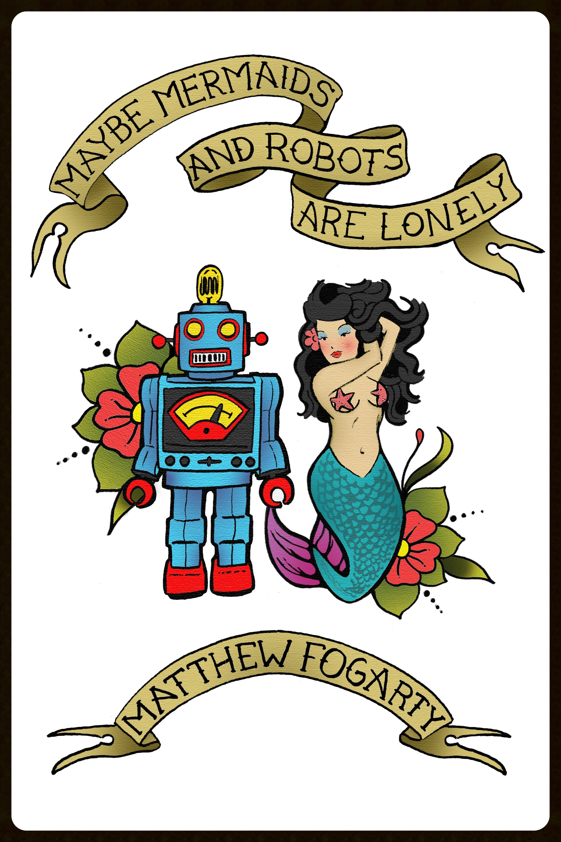
I’m not saying that cover design for a novel is easy, but there is certainly an extra level of difficulty when it comes to creating a cover for a collection of short stories. Matthew Fogarty's Maybe Mermaids & Robots are Lonely, which will be published by Stillhouse Press in September, contains such a variety of vivid, weird, and beautifully unique stories that to simply represent one story on the cover would have an injustice to the collection as a whole. While a drawing of a mermaid and a robot may give you some sense of what lies within, it does not fully illustrate the incredible range of Fogarty’s work. What about dinosaurs in space? What about Bigfoot working as a temp? What about zombies and cowboys, and a man who accidentally hangs himself on a copper wire? What about André the Giant?
An early iteration of the "tattoo" concept created by Walsh.
With Maybe Mermaids & Robots are Lonely , my goal was to capture the whole of the collection, without giving away what it's really about. I wanted to allude to the presence of mythology and science fiction mixed with stories of great depth and realism, to greet the reader by saying, “In the pages of this book, you are going to see a lot of strange things and meet many interesting characters along the way. Come on in.”
Early in the editing process, conversations with Matt led me in the direction of creating a tattoo-like cover—something bold with vivid color, heavy in meaning and closely associated with memory. From there, I made a few sketches and designs that never came to fruition. Some were gritty, some were too complex, and some were overly cartoonish, but the real sticking point was that none captured the presence of nostalgia in the book. That was until we landed on the idea of the temporary tattoo, something people associate with childhood. Temporary tattoos represent a time in life when we’re most likely to drift into a world of make-believe, when we can erase our mistakes and are allowed countless "do-overs." But temporary tattoos are also associated with the weighty notion of the permanent tattoo, a very real and deeply meaningful adult concept. To us, this seemed to align perfectly with the tone of the book.
The Final Result: Maybe Mermaids & Robots are Lonely: 38 Stories and a Novella, Stillhouse Press, 2016
I then looked at how temporary tattoos come packaged: each fit tightly together on a single sheet of paper. It seemed like a viable way to feature all (or most) of the Maybe Mermaids characters on the cover, each placed closely against the others to make an almost-solid, almost-patterned image. Matthew and I selected 18 characters and objects from the stories, and I drew out each one. In order to keep things simple, all were inked with very little detail. This allowed the images to blanket the entire area of the cover without distracting from the title and secondary text. Then I selected bright, eye-catching colors, which I felt embodied the richness and energy of the book, and the cover became what it is today.
In a single glance, the reader may pick out a mermaid, a guitar, the Pope’s hat, a dog, a yeti, or an astronaut. They may ask questions about these creatures: What is a jet and an old Plymouth doing together on book? Who is this robot? What's Elvis got to do with anything? Each image comes together as part of one large tableau that suggests a new world filled with adventure and mystery, but also feels familiar.


