From Still to Shelf Pt. 4: Book Marketing For Artists

By Michelle Webber

When students want to enter the publishing industry after college, most of them picture themselves as editors. The leap is a logical one: those of us who pursue a BFA or MFA in writing spend so much time inside the manuscript that we forget the work must reach readers to achieve its true value. Many consider marketing and advertising the antithesis of artistic creation, that marketing’s only goal is to make money for the publisher, and that this process ignores the art of the book itself. But for Stillhouse Press, this notion couldn’t be further from the truth.

From a marketing brainstorming session for Mark Polanzak's POP! (March 2016)

From a marketing brainstorming session for Mark Polanzak's POP! (March 2016)

Our marketing process begins only after we have first read the book in its entirety. We believe that to build an effective promotional strategy, there are several things we must know about the book that are best discovered by stepping into the shoes of the reader. The most important component of marketing is audience. So we ask:What is its genre? What kind of person would enjoy this book? To whom will it appeal? What other books does it remind us of?  Another crucial element is the book’s unique appeal. What about this book is different from others in its genre? What is its greatest strength? If I had to pitch this book to someone in less than 60 seconds, what would I tell them about it?  Answering these questions allows us to approach our promotional plan as readers and book lovers as well as marketing professionals.

Once we’ve read the book, our next step is to coordinate our timeline with Editorial.  As soon as we acquire a book, we work backwards from the date of publication to plan deadlines, the first of which is the printing of Advance Review Copies (ARCs, or galleys).  Publishers send ARCs to a number of contacts, including review outlets, trade publications, and potential blurbers (other authors who will read the manuscript and offer up a quote) to arrange media coverage and cultivate buzz. Each market has its own lead window (an industry term for the minimum amount of time before publication that an outlet will consider a book for review or coverage). At Stillhouse, we aim to prepare and begin shipping galleys four to six months in advance of publication.

After we’ve formed our timeline and the editorial team for the book has begun their developmental edits, we schedule a meeting with the author to talk about their publishing and writing contacts, their list of potential blurbers, and the use and development of their social media platforms.  We also discuss any upcoming publications, plans to submit new writing, and career or occupation changes so that we can leverage every advantage and increase an author's visibility. Every author brings something new to the conversation and every book is different, so we refine and tailor our marketing strategy accordingly.

Over the next several months, the marketing team works closely with the author and managing editor to build an exhaustive list of contacts for media and reviews. Each list is pulled from a central database that we continually update with new markets and publication staff changes. Once every contact, email address, and mailing address has been vetted and approved, we begin querying. This is largely the same process that authors go through when querying agents and publishing houses, only in reverse.

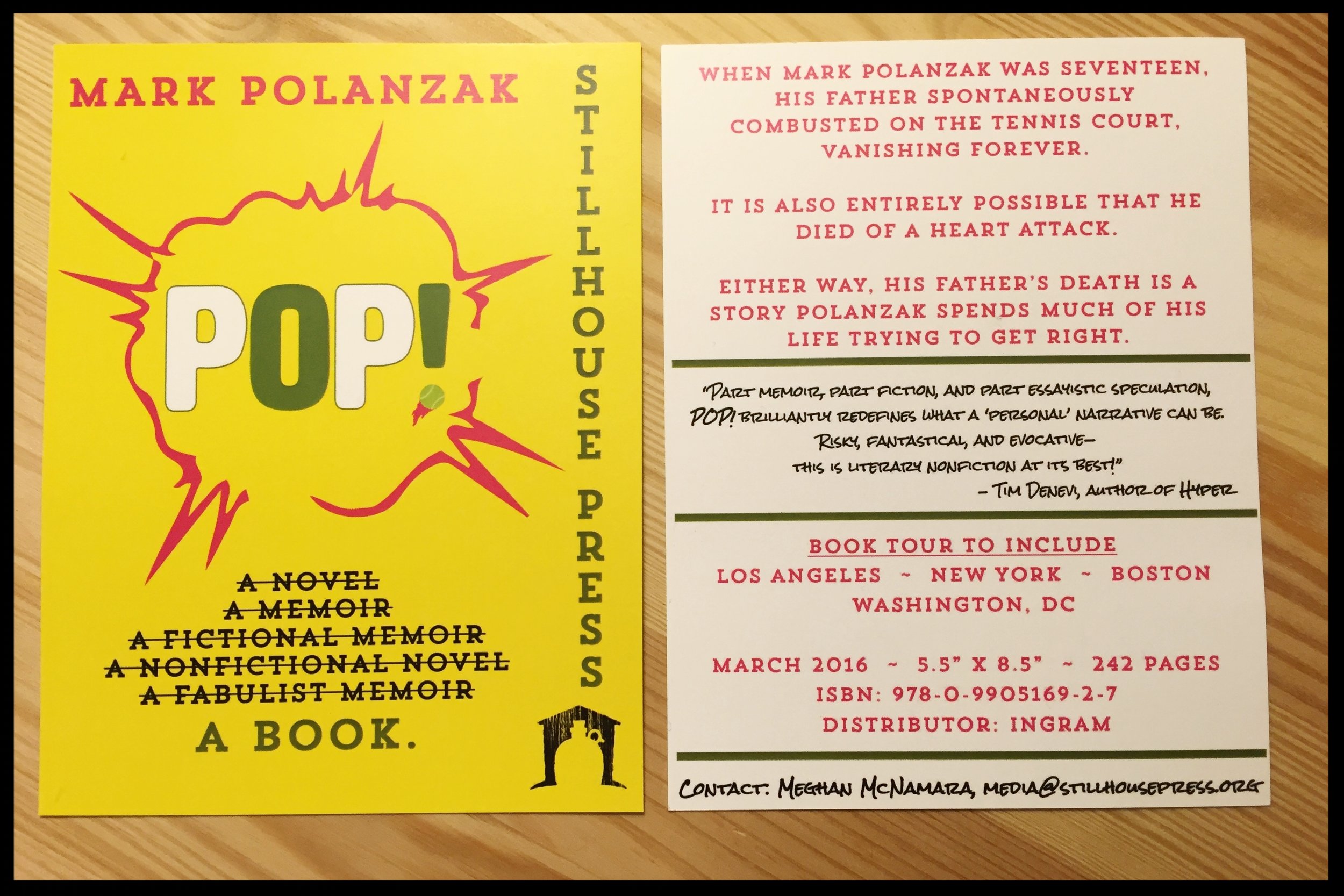
As soon as galleys are printed, proofed, finalized, and shipped to us, we begin sending packages to media.  In this package, we include an ARC and relevant publication data. We prefer to include all publication info in the form of a postcard, rather than the industry standard press release, which is often discarded, unread. We strive to ensure that the concept driving the artwork and marketing materials is consistent between the galley and the product. This process often continues on a rolling basis until the month of publication.

Once we begin to receive notifications of coverage from some of the outlets that read the book and want to feature it either in a review or in an interview with the author, the marketing team coordinates timelines with the market and the author, and adds items to our roster for social media.

While cultivating media coverage is one of our most important responsibilities, there are several more obscure components of our department that are just as essential to the success of the press. Our Social Media Editor is responsible for writing and scheduling weekly posts on Facebook and Twitter that not only increase awareness of our titles, but that also participate in a dialogue of literary citizenship. Successful media campaigns aren’t paved with purchase-centric posts. The most effective strategy is to participate in relevant conversations, share the successes of your friends in the publishing industry, and comment on recent events. The best way to maintain a strong follower base is to engage the target audience’s community.  

Maybe Mermaids & Robots are Lonely book signing at the 2016 Brooklyn Book Festival. From top left to right: Editor, Marcos L. Martínez; Managing Editor, Justin Lafreniere; Communications Director, Michelle Webber; bottom: aut…

Maybe Mermaids & Robots are Lonely book signing at the 2016 Brooklyn Book Festival. From top left to right: Editor, Marcos L. Martínez; Managing Editor, Justin Lafreniere; Communications Director, Michelle Webber; bottom: author, Matthew Fogarty.

The marketing team also plans book tours and promotional events, both in the local area and across the country. Some of our events are recurring each year, including readings at Fall for the Book, AWP, and other literary conferences. If the event is local, the marketing team services and coordinates logistics.

Marketing is perhaps the most collaborative process at Stillhouse Press. Members of our team work closely with authors, managing editors, stakeholders, and industry professionals to ensure that our titles not only sell but that they also reach readers who value them. By taking into consideration the strengths and audience of the work, the network and media presence of our authors, and the literary climate into which each project is released, we are able to construct a plan that pleases all parties. Marketing, then, isn’t just about making money for the press. It’s about making happy authors, too.


Michelle Webber has worked as a reader, an Editorial Assistant, and Social Media Editor for Stillhouse Press and currently serves as the Director of Marketing and Communications.  She is working on a science fiction novel and will graduate with a BFA in Fiction from George Mason University in the spring of 2017.

From Still to Shelf, Pt. 3: The Ins and Outs of Book Design

When a manuscript has finished its journey through developmental editing, substantive editing, and copyediting, it’s still just a text document. The actual process from manuscript to book involves more than just slapping on a copyright page and cover. Hundreds of tiny choices must be made along the way: what font should be used for chapter titles, body text, the epigraph?  What kind of symbol or image should provide scene divisions?  How much white space should the book contain? What should the color scheme of this book be? Artistic and highly specialized professionals guide Stillhouse Press in these decisions, making up the core of our design team. 

We rely primarily on two people for the bulk of our design work: Kady Dennell, a freelance designer develops our interior layout and design, while our Art Director, Doug Luman handles cover design and brand development. Like each aspect of Stillhouse, book design is a collaborative process between. It’s important to us to not only develop an aesthetic and marketable product, but also to create a book that serves as a visual archetype to its literary content. For this post, we invited Kady to share some of the intricacies of this process.


Interior

Kady Dennell

The interior design process begins with design inspirations (interior layout and font choices used in other books that are either market matches for the current project or just well-designed products) from the author, the book's managing editor, and Stillhouse's Editor in Chief, Marcos L. Martínez. After the team decides on a direction, I browse through my library of fonts or research online for typefaces that will achieve the desired look. There are many aesthetic “families” that exist in typography, each with its own aesthetic consequences. The style of a font and its placement on the page, while it seems a simple thing, can completely alter the meaning of the content.  Consider a sign for a hardcore workout bootcamp written in delicate cursive, or an entire novel presented in bolded comic sans. Neither of these properly evokes the genre, purpose, or central aesthetic of the content that the physical language is meant to represent.

A mid-process design mock-up for the cover element of POP!

A mid-process design mock-up for the cover element of POP!

Once I’ve found a set of typefaces that match our intended aesthetic, I then propose two or three layout concepts to the publishing team for their input. These concepts will consist of ideas for page number placement, text size, font, headline placement, and body copy font and leading (the actual justification and margin work of copy on the page). From there, I adjust the layout design and prepare style guides and master pages in Adobe InDesign, an industry staple for publication design. The next step is styling the text for the whole manuscript, which is usually done with two main fonts (one for chapter titles and another for body copy). After all of the type is stylized, I adjust spacing to minimize orphans and widows—the design term for words left dangling across lines or left on lines by themselves. Once the manuscript is laid out in its entirety, I submit the file to the editorial team and they do a comprehensive review of the now fully designed book. Once their comments return, I implement any final changes and design edits, and then the final is ready for print.

Interior

Michelle Webber

The cover is the face of the book.  It is the first and often only chance to grab the attention of readers and encourage them to investigate what’s inside.  A bad cover—one that is ugly, busy, or confusing to its audience—can lose sales, regardless of the quality of the content within. Alternatively, a good cover aims to convey key elements of that content and inspires the reader to take a closer look. 

Our design process varies from book to book.  Some manuscripts immediately suggest a strong design direction.  For example, the design concept for Matt Fogarty’s Maybe Mermaids and Robots are Lonely emerged more or less as soon as our editorial team began discussing it (for a detailed look, read designer Alex Walsh’s post).

While the exterior design process is constantly evolving, it always begins with a conversation between our art director, Doug; the book's managing editor; the author; and the marketing team.  Some authors are more opinionated about the content of their cover than others.  Many come to the table with a list of things they absolutely do not want, which gives Doug a good place to start, though the beginning mock-ups are usually born from the manuscript itself.  Once a general aesthetic for the cover has been developed, it's up to the designer to produce three or four concepts, which are then presented to the editorial and marketing staff for fine-tuning. The concepts are the narrowed down to one or two options. Usually, the agreed upon cover concept goes through three or four drafts before reaching its final state, which includes the placement of our logo and branding, the cover copy, and the final spine design.  At that point, the marketing team signs off on the cover and it returns to Doug for final adjustments and rendering.

Once the interior and exterior designs have been finalized, the manuscript is then submitted it to our printer and a proof is ordered.  If everything looks as it should, advance review copies (ARCs) or "galleys" are ordered. These are sent to media and used to proof the book before it is sent out for final printing.


Kady Dennell is a freelance designer living in Portland, OR. She enjoys working with typography, (loads of) color, and photography. You can find her work at kdennell.com.


Michelle Webber has worked as a reader, an Editorial Assistant, and Social Media Editor for Stillhouse Press and currently serves as the Director of Marketing and Communications.  She is working on a science fiction novel and will graduate with a BFA in Fiction from George Mason University in the spring of 2017.